callan \ blog
february 13th, 2016
On Thursday, I went to an Arts at MIT lecture/panel about the future of libraries. The focus was on 21st century service design and space planning, and it's true there are unprecedented opportunities right now - what architect wouldn't jump at the chance to work on a building that could help revolutionize a field looking for radical change, redefining itself as we speak? From a pragmatic standpoint much of what was demonstrated and discussed is pie-in-the-sky stuff for many libraries, but dreaming about what's out of reach is a good thing to do from time to time. The optimism of a rose-tinted sci-fi future vision can be refreshing, regardless of whether it's likely to be coming.
Architect David Adjaye showcased the stunning work his firm did with two neighborhood branches of the Washington, D.C. system, the Francis Gregory and William O. Lockridge/Bellevue libraries. D.C. has 25 branch libraries, which is on par with Boston's 24; the two cities are roughly comparable population and area-wise. Both buildings were overhauled with visions of becoming community gathering spaces in mind, seamlessly permeating their neighborhoods and natural surroundings.
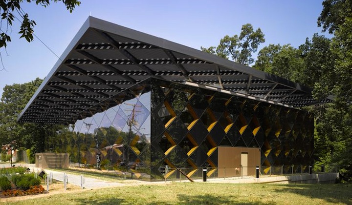
Francis Gregory Library in Washington, D.C. (Source: Pinterest)
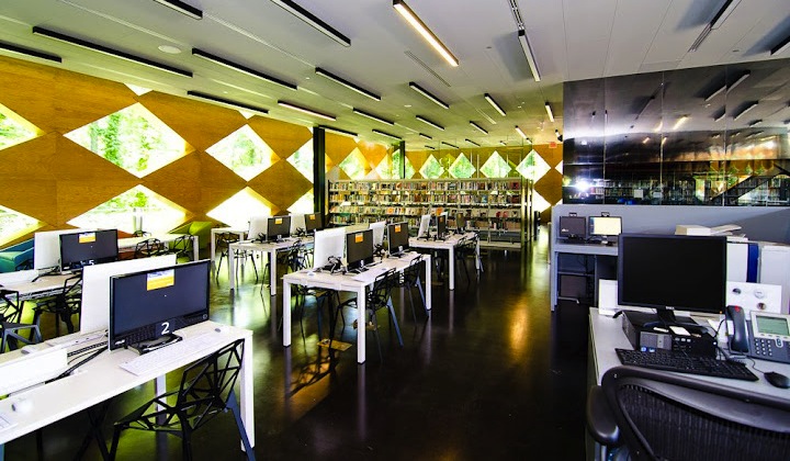
Francis Gregory Library, interior shot. (Source: DC Mud)
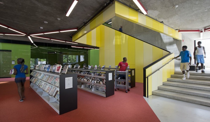
William O. Lockridge/Bellevue Library. (Source: Wiencek + Associates)
Adjaye also talked about his Idea Stores, educational community centers in the U.K. that provide library services in addition to medical clinics, classroom space, and free computer use. In the U.K., libraries face public funding cuts and severely lacking governmental support to a degree not yet really seen in the U.S. The Idea Store rebrands the institution entirely, a strong response to the perception of libraries as outdated book warehouses. For a glimpse into the creative, fluid, user-driven world of the Idea Stores, take a peek at their Flickr stream.
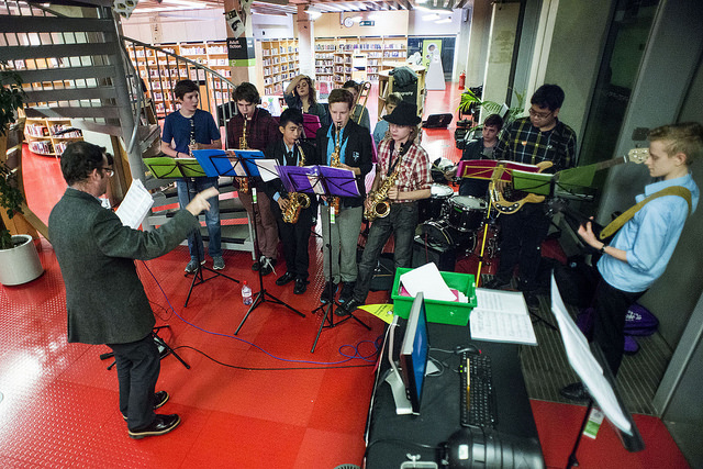
A school band performs for the 2015 Writeidea Festival, held at Idea Store Whitechapel. (Source: Flickr)
Nader Tehrani, principal at Boston-based firm NADAAA, spoke about the success of a diverse design review committee - and the creative potential of design constraints - when setting up a 21st century service model inside an early 20th century building for the Rhode Island School of Design (RISD)'s Fleet Library. FleetBoston generously donated an Italian Renaissance-style banking hall and the floor above it to RISD in 2002, and the school immediately seized the opportunity to rehouse its long-overcrowded library. But the existing floor plan and fixtures in the bank were not attentuated to the space needs of the student body at a vibrant present-day art school.
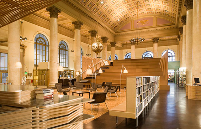
RISD Fleet Library, Providence, RI. (Source: UCLA AUD)
The project's design review committee teamed architects with students, faculty, and campus staff to find structural solutions. This gave way to features like the Study Pavilion, a space-maximizing combination of study and workspaces including a reconfigurable bleacher-style seating area used for everything from fashion shows to author readings. A key piece of the puzzle was moving the stacks to flank the building's periphery, opening up large spots for flexible, adaptive new uses.
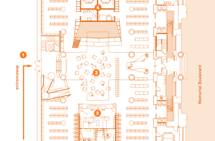
A slice of the Fleet Library's floorplan. Pushed off to the side this way, the stacks surround the open spaces in the building rather than interrupting them, remaining fully browsable. (Source: Fleet Library pamphlet)
Also on the panel were Jeffrey Schnapp, director of Harvard's metaLAB; Chris Bourg, director of MIT Libraries; and Ginnie Cooper, recently retired chief librarian of the D.C. Public Library (the redesign of the aforementioned D.C. branches happened during her tenure).
Schnapp bridged gaps between the past and present roles of libraries, suggesting the old book storage ways could be augmented and modernized with programmable stacks. "What if, when walking through the stacks," he asked, "instead of recognizing the books, the books recognized you?"
A project from the Library Test Kitchen, a course Schnapp co-taught at the Harvard Graduate School of Design. In this video, the impermanence of information is made real with a chocolate frosting printing press.
Bourg used the recent discovery of gravitational waves to construct a metaphor for what libraries do today. She paraphrased a scientist who described black holes colliding and making a "whoosh" sound, not unlike a household vacuum. The tangibility of that description, she said, is akin to the library providing a physical space for understanding and interaction in our increasingly abstract, digitally-mediated lives.
Cooper reminded the audience that the "publicness" of the public library is a benefit and a drawback. The community served by a library benefits from its openness to all, but that means it's also open to all public opinion, the good and the not-so-good. Coupled with funding complexities, this can lead to a rocky road towards innovation or new buildings, but persistence and positivity through it all is paying off for libraries across the country.
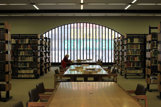
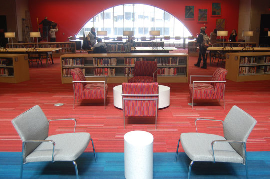
The Boston Public Library's Johnson Building - 1972 colors above, 2015 colors below. (Source: WBUR Artery)
All told, it was an inspiring evening with a well-rounded set of perspectives - positive and pragmatic; at times realistic, at others science fiction-worthy. As I felt after attending a similarly-themed talk at Harvard during Hubweek last year, the only downside was the brevity: less than two hours for five presentations, a panel discussion, and audience Q&A. It's time Boston hosted a conference on this topic, dontcha think?
(Side note: the D.C. Public Library has one of the most elegant, beautifully simple, user-friendly websites I've yet encountered in libraryland. It's well worth a look if you're interested in such matters.)
home | top
Hey Cal, why is there no comments section? Comments sections have a tendency to devolve into nasty little spaces, teeming with spam & ad hominem attacks. I also have a fondness for the 1.0 Web (props to Neocities, powerer of this site). If you'd like to share your thoughts, find me on Twitter or fire off an email. Thanks!