callan \ blog
| i’m good, thanks: towards menulessness, part 1
december 14, 2015
Over the weekend I was chatting with a sound designer about the beauty of the menuless synthesizer: the kind where there’s sufficient enough knobs, sliders, and/or buttons for you to never have to go digging through banks and sub-banks of parameters to be able to edit a sound.
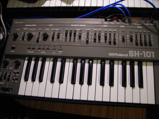
The Roland SH-101, released in 1982: lots of knobs and sliders.
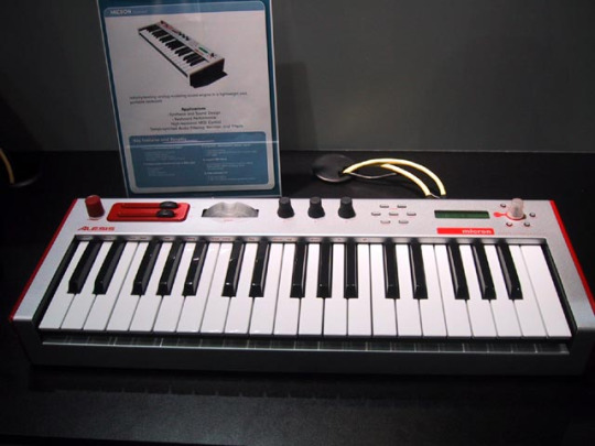
The Alesis Micron, released in 2004: not so much.
For maximum control over real-time sound editing, the former is pretty inarguably better than the latter. Think instant gratification: with a synth like the SH-101, though its capabilities and memory are somewhat limited (its production run was 1982-86), you can hold down a note and start fiddling away with the sliders, immediately hearing the results of whichever settings you've got your finger(s) on. With a synth like the Micron, you’ve got a sophisticated computer running under your keys that will let you do any number of things, ranging from programming complex note sequences to assigning different effects to its handful of controls. But you can’t change 11 or 12 dimensions of the sound you’re using in a matter of seconds, because you’d have to alternately turn and press that little clear knob on the far right of the Micron to navigate through its various menus, displayed on the little greenish screen to the left of the nob.
This isn't to champion one over the other - they're pretty much apples and oranges in terms of their sounds, features, and associated genres. The Micron hit the market nearly 20 years after the first SH-101s were built, and synths changed as much as computers did in that time frame. I play a microKorg, a contemporary of the Micron that handles the complex menuing of digital synths in a different way.
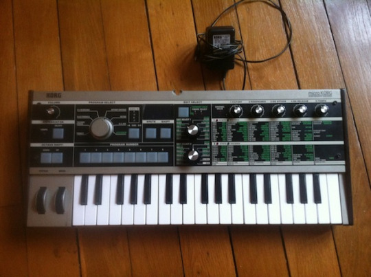
The Korg microKorg, released in 2002: menus and sliders all in one spot
Under each of the five knobs on the right panel, there's several columns of green and white text. These explain what effect or parameter is being edited by each of those five knobs when they're paired up with the menus selected by the knobs in the middle section of the synth. In other words, you pick the effect or parameter you want to change with one of the middle dials, then you use the five knobs to edit that effect or parameter.
The text on the panel is always there to remind you of what you're editing, which is a good way to stay sane when you've only got a three-character display to work with:
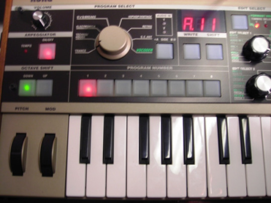
The microKorg speaks only through a three-character LED display.
So, this is a great way of keeping 'knowledge in the world,' as Don Norman would put it. You don’t have to learn the microKorg’s three-character language - e.g., "utP" with a little line over the "u" means "write protect" - to remember what combination of knobs will let you add delay or change the tuning of an oscillator. You can just look at the list of effects on the panel and take it from there, though the synth's manual still comes in handy for more advanced editing. The menu on the panel is a good place to start, anyway. It beats rooting around dense digital menus where there's not much wayfinding built into the system and no graphical interface beyond that little three-character display.
I bring up synth menus because I've been thinking a lot about website navigation menus. Building a menu that works is maybe the hardest part of information architecture; it's among the most important, too. As usual when I'm stumped, I've been on the prowl for best practices and trends trying to figure out how others are dealing with menus in this here final month of 2015, and it's starting to look like the way they're dealing with it is... by not dealing with it at all.
Yes, it looks like the menu could be going the way of scrolling text and uncontrollable background music. Info-seekers of the 21st century seem to appreciate immediacy, especially on large sites; we like enough knowledge in the world to help get us to what we want ASAP. Maybe that initial stop at the top nav, that time spent trying to understand the categories or sections and pick the right choice to get started and follow some sort of semi-linear track, is just getting in the way of getting to what we want.
(Continued in part 2 and part 3.)
home | top
Hey Cal, why is there no comments section? Comments sections have a tendency to devolve into nasty little spaces, teeming with spam & ad hominem attacks. I also have a fondness for the 1.0 Web (props to Neocities, powerer of this site). If you'd like to share your thoughts, find me on Twitter or fire off an email. Thanks!