callan \ blog
| i’m good, thanks: towards menulessness, part 2
december 16, 2015
(Read part 1 if you haven't yet.)
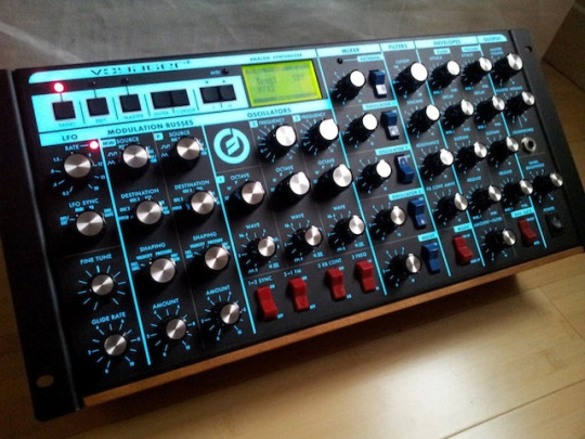
The Minimoog Voyager (rackmount edition) - knob-a-palooza, y’all
Look at all that knowledge of what this little guy can do, oozing from the front panel and out into the world. Moog's Voyager family has been responsible for some of the craziest and most versatile soundscaping known since it appeared in the early 2000s; its users span the heretofore unconsidered stylistic range from Red Hot Chili Peppers to Bjork to Dream Theater.
Along with buttons, knobs are perhaps the ultimate signifier on machinery of any kind - the clearest implication that you can do something to something. What makes modern synths more versatile than their forebears is the combination of signifiers and intuitive controls with powerful software.
Audio editing programs like Ableton Live and Logic put a bajillion sounds and effects for editing at a synthesist's fingertips, but trackpads and mice aren't knobs or buttons or sliders - few people want to click and drag a graphic representing a volume knob to turn up their instrument, or attempt to play drum patterns by typing random letters on a computer keyboard, when they're performing live.
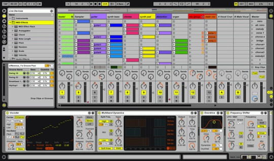
Ableton Live: All of those little circular icons are knobs. Clicking and "twisting" them with a mouse tends to get old fast.
Enter the USB-connectable control pad. These devices, like the QuNeo below, team up with your software to let you map different instruments and settings to buttons as you see fit. Put another way, the software's virtual representation of a knob, button, or slider is made physical again.
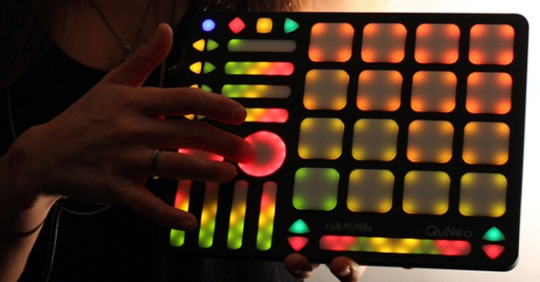
The QuNeo from Keith McMillan Instruments has a mappable drum pad, play and pause buttons, and a bunch of other customizable controls, keeping it easy to make the sounds you want to make.
So, what does any of this have to do with website menus? Well, let's take a look at a website. When I first saw The Verge's homepage, I immediately thought of the QuNeo.
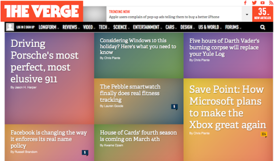
theverge.com - Various ad and tracking blockers are affecting the display in this screenshot, but you get the general drift.
There's a main menu here - the black bar across the top - but look how little visual weight that's given. The font size is small, and though it's capitalized, it's a pretty milquetoast typeface compared to the voluptuous serif (Adelle, according to code inspection) saved for the headlines in the body content. If you keep scrolling down the page, you’re met with a lengthy feed of more stories with prominent headlines, Tumblr-style.
You'd never have to use the menu on a site like The Verge's if you didn't want to, or didn't feel a need to browse exclusively within a specific topic. The headlines and the variety of stories they describe allow for immediate access to content - no need to take the top nav-guided tour to get to the informational meat. These little content-nuggets are descriptive enough to give a good sense of their subject matter while not being in immediate danger of causing any eye-glazing. And they frame news content in a way that reflects the wider environs of the popular web in 2015: cozying up to a social media-type feed, another place where menus really don’t matter all that much.
home | top
Hey Cal, why is there no comments section? Comments sections have a tendency to devolve into nasty little spaces, teeming with spam & ad hominem attacks. I also have a fondness for the 1.0 Web (props to Neocities, powerer of this site). If you'd like to share your thoughts, find me on Twitter or fire off an email. Thanks!