callan \ blog
| i’m good, thanks: towards menulessness, part 3
december 20, 2015
(Continued from part 1 and part 2.)
OK, so last time, I started in on comparing the slow (d)evolution of general website structure into social media platform design. Social media sites tend to be light on the navigation and heavy on the main content. They also do a lot to aim your eye as you scroll down a page, where increasingly the left menu tends to vanish and the only navigation you're left with is a sticky (i.e., fixed to the top even as you continue scrolling) header.
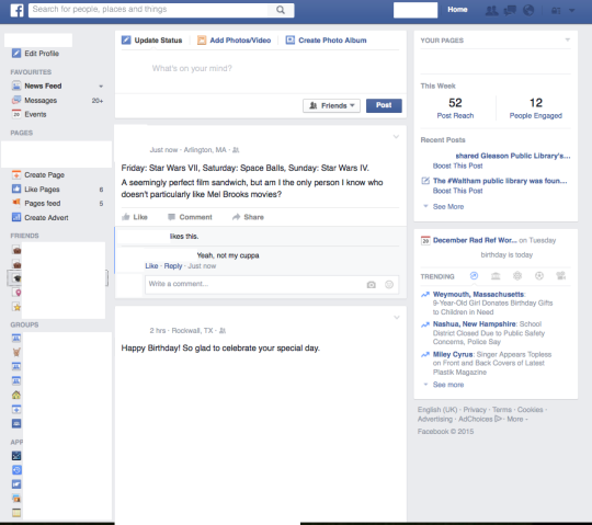
Facebook news feed, above the fold
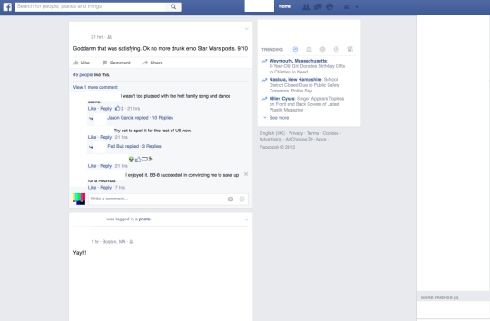
...and below the fold
For anonymity's sake, I've cleared out names and avatars and post content. But the stark monochromatic interface of Facebook, paired with the bold blue links we all have been dutifully trained to recognize as proper nouns - friends' names, institutions, band pages, companies, and beyond - paired with icons and sizable post content seems to be enough to keep us moored as we neverendingly scroll further down the purgatorial news feed.
News sites seem increasingly fond of this approach, too - the sticky header of sections is alive and well on The New York Times, for instance.
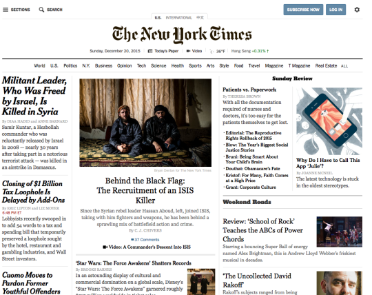
The New York Times, above the fold
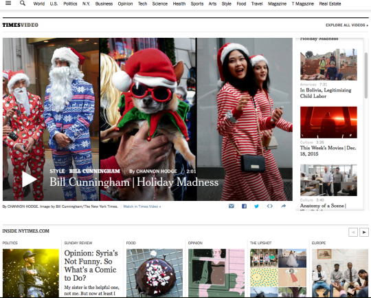
The New York Times, below the fold. The section menu is still sticky at the top, but it’s far from the focal point
The six vs. one column difference is interesting - Facebook is unapologetically hyper-local, so it makes sense for them to not "section" their content in the traditional newspaper sense. Both layouts encourage a general disengagement from the site navigation. Facebook eliminates the left navigation entirely, while the NYT dithers the visbility of the top bar in lieu of dynamic, colorful images in the body content.
And there's plenty sites out there that jettison the sticky top menu and just send you freewheeling into contentville, too - both "old media" and new, from The Boston Globe to Buzzfeed. As a whole, it looks a lot like serendipitous browsing is supplanting the old step-by-step workflows of finding information online - a real pivot towards ambient findability.
Synths from companies that respect the power of usability are well aware of this. When there's no choice but to fall back on menus, brands that zero in on playability and fun vs. RTFM superiority complexes are doing it right. This is why I'm a Korg aficionado. Korg synths toss out oodles of knowledge in the world.
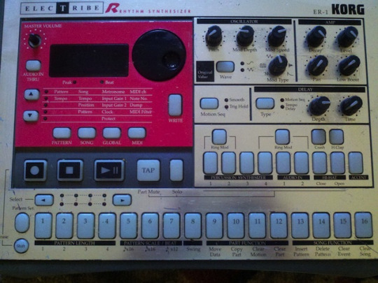
The Korg Electribe ER-1, a drum machine that continues to be All the Rage™ 16+ years after its release
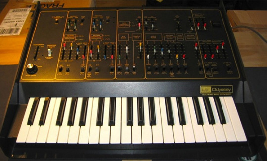
The Korg reanimation of the classic 1970s Arp Odyssey synth - just look at all those pretty controls
Both of these interfaces are a bit text-heavy. But they help eliminate the reliance on simple or non-existent LED displays and product manuals; as a result, they're easier to understand and easier to play. Similarly, do I give a mouse's bum about whether or not whether "The Posts That Held [Me] Longest" was a post from The Upshot, or if the latest Star Wars thinkpiece wound up in Business or Arts & Entertainment? Noooope. I'd rather just twiddle a knob or flick a slider than spend half an hour trying to rephrase my confusion into the form of something that might be a subtopic of something listed in an index. Context continues to collapse, and content is what's left, 'cause that's what you want and that's what you got: right away, no digging, no menuing, no pathfinding.
Just like I wanna grab the cutoff and resonance knobs on my synth and twiddle them until I hear this. I'm into instant gratification as much as the next person. I mean, that's why we're making bookstore-style displays in libraries - with the covers turned Barnes & Noble-approved outwardly, rather than just stacks upon stacks with only a spine and a sticker to rely on - right? That immediate, visceral reaction: Facebook gives us the seeds for that through names we recognize in bold blue text; news sites do it through colorful thumbnails and incendiary headlines; bookstores and libraries do it with outward displays.
Menus on the web feel like they're playing second fiddle to wayfinding that's embedded in content - headlines, author names, usernames, avatars, images, videos, etc. It's not hard to see why, especially when information consumers could be more likely to click on whatever's at the top of the feed than to connect the topical dots of site navigation. But can you blame them? Instant gratification auto-spurns categorization. The number of clicks from starting point to actual information sought might not be all that important anymore, but if the click count can be brought down to one or two, it never hurts. It's possible dense or outmoded navigation menus are standing in the way.
Of course, the needs of every site are very different, but it's not a stretch to say every site should be navigable, either though traditional main menus or other wayfinding design. The expectation now is that navigability ought to be as seamless and intuitive as possible. Give us as many knobs as you can - a whole mess of bold blue links, or bright, contrasting icons - and we'll twist 'em around 'til we get what we want.
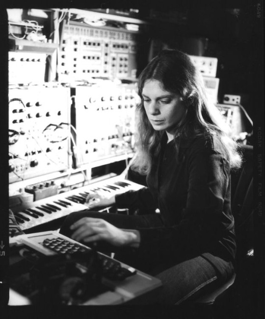
Laurie Spiegel, synth sorceress of note, with a whole bunch of knobs at her disposal
home | top
Hey Cal, why is there no comments section? Comments sections have a tendency to devolve into nasty little spaces, teeming with spam & ad hominem attacks. I also have a fondness for the 1.0 Web (props to Neocities, powerer of this site). If you'd like to share your thoughts, find me on Twitter or fire off an email. Thanks!