callan \ blog
| writing for the web is hard (part 1)
april 27, 2016
(Note: My hope is to make this a multi-part series. Not sure how many parts or if I can hold myself to that at all. We'll see how it goes!)
Slowly but surely, our redesigned site slouches towards the web to be born. As we shift contractual gears from design to development, I've been hanging out in the lay-by of content strategy. For us, that means rewriting a whole ton of copy that's gone untouched for years - eight on average, if I had to guess.
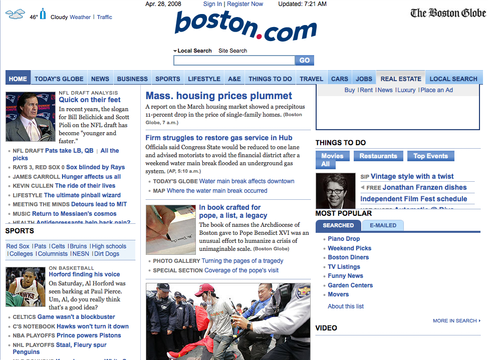
Eight years is basically a geological epoch in internet years. Consider Boston.com on April 27, 2008:
...and here we are today:
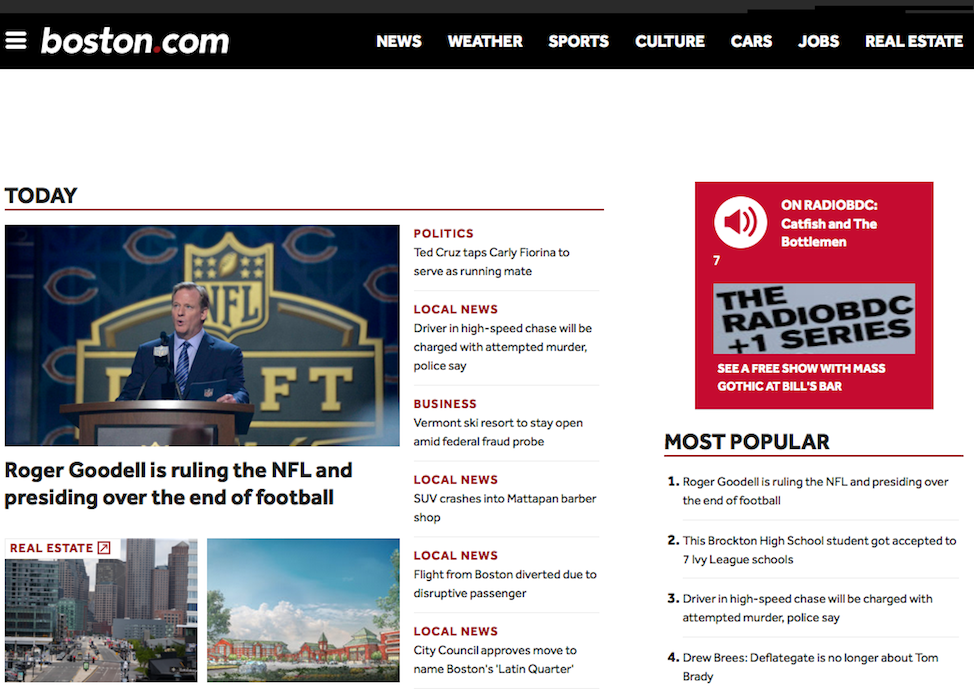
The aesthetics have changed a bit, wouldn't you say? That crowded multicolumnar layout that newspapers adhered to online for so very long (and, well, some still do) was alive and well in 2008. By comparison, the homepage today takes advantage of white space, larger photos and text, and a much simpler navigation menu. And while the 2016 version is as imperfect as any other responsive website made by actual humans, I'd bet my bananas that it would look a hell of a lot better on a phone than the 2008 one would.
Excessive reliance on physical media precedents aside, newspapers have been killing it with one thing from the minute they went on the web: writing for it. They carried over the lessons they learned from years of space and layout constraints, not burying ledes, and inverting the pyramid. Everybody else, though - not so much.
Especially in the earliest iterations of their sites, companies, organizations, and governments struggle to write clearly and concisely. When they're not in the process of selling you something, companies like to submerge readers in happy talk, meaningless press releases, and laundry lists of FAQs (as in, the Qs they wish were FA'd). Governments robotically toss every scrap of information, typically in explicit droll detail, on their sites. Why?
Because the people writing for those sites probably don't consider, or understand, their audience. They may not even think in terms of having an audience at all. That's bad enough for sites that aim to serve a specific task or group of people, but can get even worse when the audience in question is potentially everybody. As the Pew Internet Project's 2014 report on public library engagement puts it,
"The impact of digital technologies on public libraries is particularly interesting because [they] serve so many people...and try to meet a wide variety of needs. This is also what makes the task of public libraries - as well as governments, news organizations, religious groups, schools, and any other institution that is trying to reach a wide swath of the American public - so challenging: They are trying to respond to new technologies while maintaining older strategies of knowledge dissemination."
So, if you know you've got a huge audience and you're reaching out to them through dated means, what's a mother to do? The first step in the right direction, particularly for sites that predate most of today's social media platforms, is realizing the content on your site is not there exclusively for you or your coworkers.
When internet use was still growing, you could get away with tacking on whatever content you or your manager wanted to access through this newfangled virtual filing cabinet. You could set each department up with its own section, because that's how you've always organized everything, right? Makes perfect sense in the office. And the more the merrier, too - look at all the things you sell, the services you offer, the related grants you know about, the places where customers or applicants can find more information. It's all so interesting and impressive - and the best part is, you don't need to wait for anybody to approve or edit or print your content. You can type it up and blast it out into the world all by yourself!
The only problem with all that is... nobody actually cares.
People don't read online; they scan. They visit websites to order shoes, request appointments, register for events, get directions, browse the top headlines. Think about it: when's the last time you went online just to wander aimlessly on a company's website? Have you ever opened a restaurant's page from a list of search results and thought to yourself, "Oh here we go, I'll just mosey on through page by page and get a feel for the kind of place this might be?" Nope - you went there for a menu. Or to find out if they deliver, or are open until midnight, or take reservations. You went there to do something, not to just hang out.
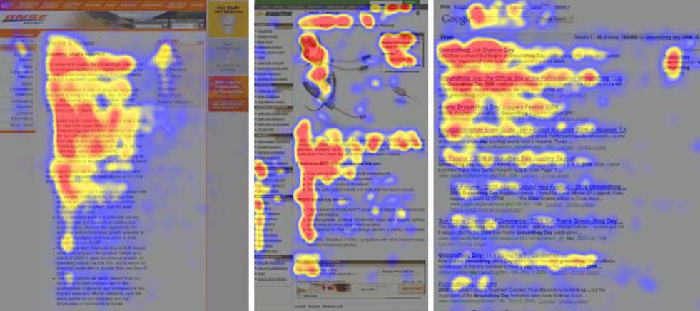
Eyetracking studies show people tend to follow F-shaped scanning patterns when they see text online. Expect to see this image, or one like it, every time a web writer talks to you about readability.
Key to understanding your audience, big or small, is realizing most people care about very close to nothing that's on your site at any given time. They are interested in one thing, or a handful of specific things that help them accomplish a specific task (like a set of application forms). And sure, it's true that people will occasionally spot something eyecatching when they're not looking for it - digital media companies thrive on that serendipity, and try all sorts of tricks to make it happen (lists of popular articles and articles "you might have missed," links to as many sections and topics as they can manage squeezing on a homepage, recommended reading from partner sites "around the web").
But far more often than not, people want to come to a site, find what they're looking for, and gtfo. And that's okay. Don't take it personally. It's not because your content is inherently disinteresting or without value; it's because they've got shit to do.
That's why we invented blogs like this one, where I can ramble at you about niche topics and not lose sleep over whether or not you found what you were looking for. When you feel like getting long-winded, consider sharing your thoughts through one of the other countless publishing platforms you can hop on through your address bar... or go write a textbook.
home | top
Hey Cal, why is there no comments section? Comments sections have a tendency to devolve into nasty little spaces, teeming with spam & ad hominem attacks. I also have a fondness for the 1.0 Web (props to Neocities, powerer of this site). If you'd like to share your thoughts, find me on Twitter or fire off an email. Thanks!